pacman::p_load(rstatix, gt, patchwork, tidyverse)In-Class Exercise 4
Import Packages and Data
exam_data <- read_csv('data/Exam_data.csv')Visualising a Normal Distribution
First Attempt: QQ Plot
We can use a QQ plot to visualise whether a distribution is normal or not. In the plot below, the points deviate significantly from the straight line, indicating that the data is not normally distributed.
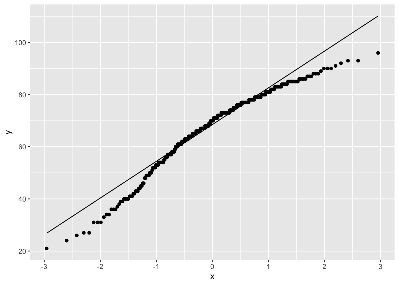
ggplot(data = exam_data,
       aes(sample=ENGLISH)) +
  stat_qq() +
  stat_qq_line()
Note
We use stat_qq() and stat_qq_line() methods to plot the QQ plot. Note that here aes takes an argument called sample instead of typical x and/or y.
Second Attempt: QQ Plot + Statistical Test Table
We can add a table showing the results of a formal statistical test for normality. Here we use the Shapiro-Wilk Test.
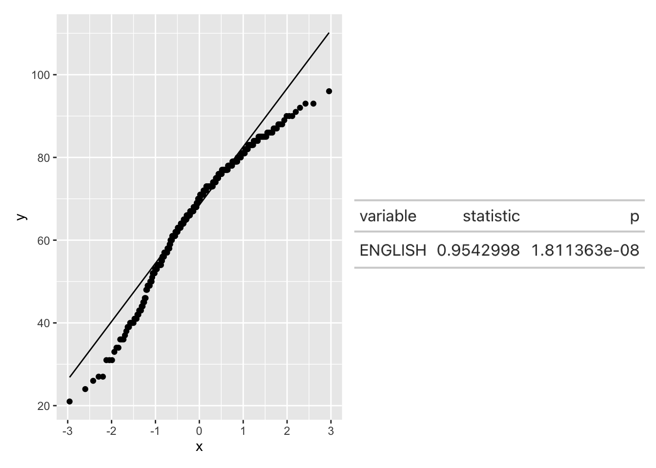
qq <- ggplot(data = exam_data,
             aes(sample=ENGLISH)) +
  stat_qq() +
  stat_qq_line()

sw_t <- exam_data %>%
  shapiro_test(ENGLISH) %>%
  gt()

tmp <- tempfile(fileext = '.png')
gtsave(sw_t, tmp)
table_png <- png::readPNG(tmp, native=TRUE)

qq + table_png