pacman::p_load(tidyverse)In-Class Exercise 1
Getting Started
Install and Load R Packages
Import the Data
exam_data <- read_csv("data/Exam_data.csv")Rows: 322 Columns: 7
── Column specification ────────────────────────────────────────────────────────
Delimiter: ","
chr (4): ID, CLASS, GENDER, RACE
dbl (3): ENGLISH, MATHS, SCIENCE
ℹ Use `spec()` to retrieve the full column specification for this data.
ℹ Specify the column types or set `show_col_types = FALSE` to quiet this message.Working with Themes
Changing the colors of plot panel background of theme_minimal() to light blue and the color of grid lines to white.
ggplot(exam_data,
       aes(y=RACE)) +
  geom_bar() +
  theme_minimal() +
  theme(panel.background = element_rect(fill='lightblue', colour='lightblue'),
        panel.grid.major = element_line(color='white'))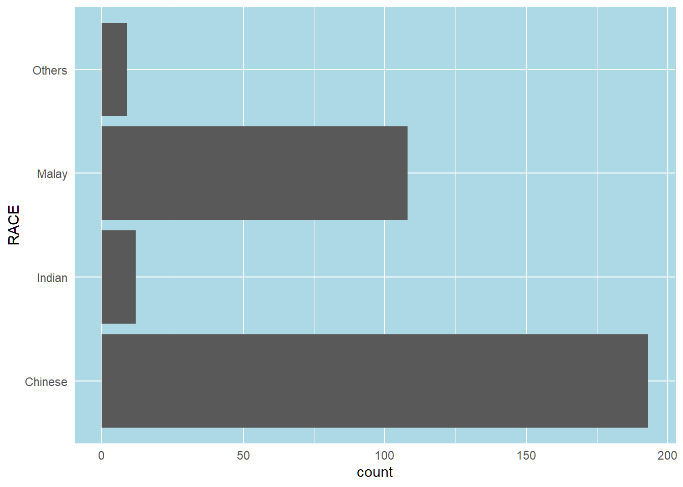
Designing Data-Driven Graphics for Analysis
I. Bar Chart Makeover
Before
y-axis labels is not clear. Bars are not sorted. Frequency values not available.
ggplot(exam_data,
       aes(x=RACE)) +
  geom_bar()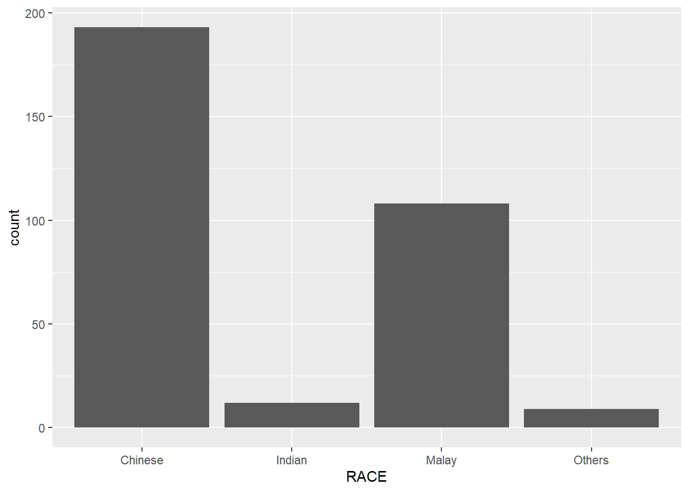
After
The y-axis has a clearer label, the bars are sorted by frequency in descending order, and frequency and percentage labels are provided for each bar.
ggplot(exam_data,
       aes(x=fct_infreq(RACE))) +
  geom_bar() +
  geom_text(aes(label=paste0(after_stat(count), sprintf(' (%.1f%%)', prop*100)), group=1),
            stat='count',
            vjust=-0.5,
            colour='black') +
  labs(x='Race', y='No. of Pupils') +
  scale_y_continuous(limits=c(0,220))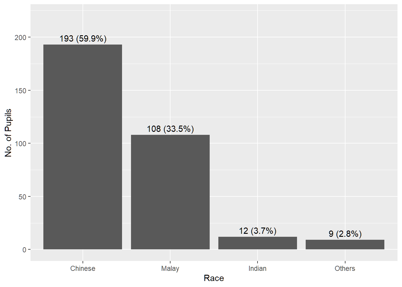
II. Histogram Makeover
Before
Fill and line colours make it difficult to see the individual bins. No mean or median reference lines.
ggplot(exam_data,
       aes(x=MATHS)) +
  geom_histogram(bins=20)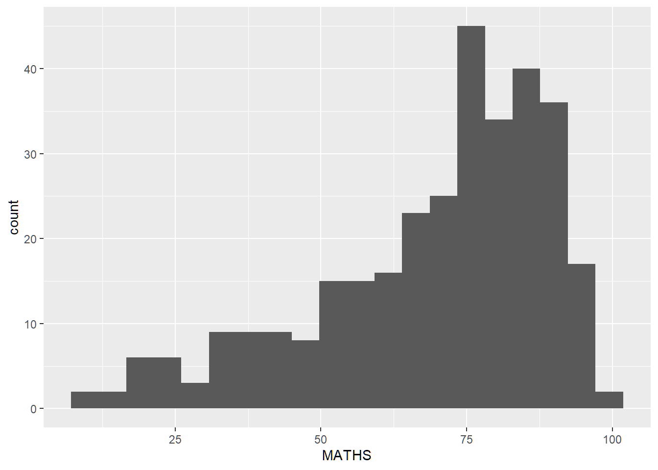
After
Changed fill and line colours. Added mean and median reference lines (red and black respectively).
ggplot(exam_data,
       aes(x=MATHS)) +
  geom_histogram(bins=20,
                 color='black',
                 fill='light blue') +
  geom_vline(xintercept=mean(exam_data$MATHS), color='red', linetype='dashed', size=1) +
  geom_vline(xintercept=median(exam_data$MATHS), color='black', linetype='dashed', size=1)
Warning: Using `size` aesthetic for lines was deprecated in ggplot2 3.4.0.
ℹ Please use `linewidth` instead.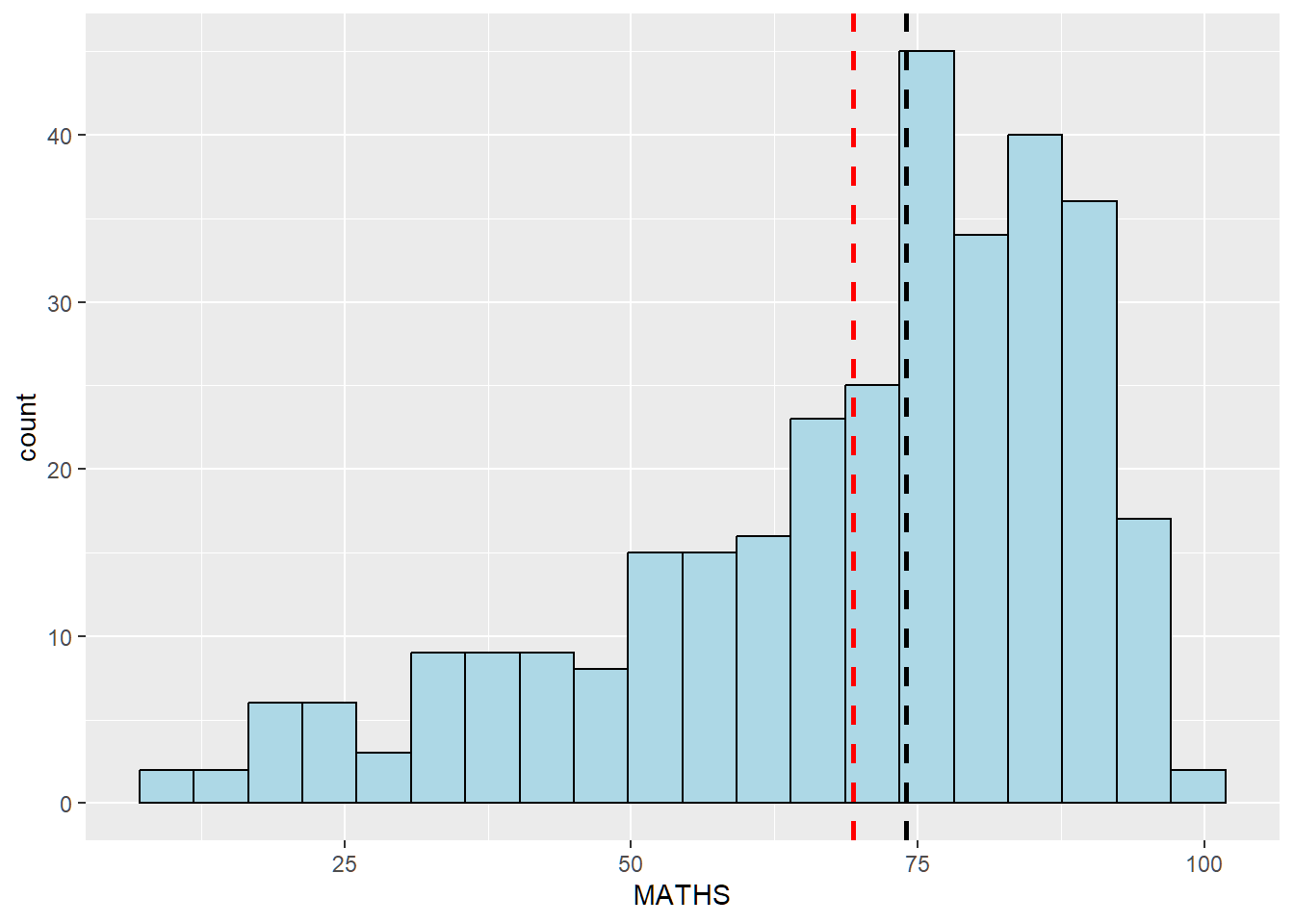
III. Histogram Makeover 2
Before
Histograms show distribution of English scores by gender, but without context of all pupils.
ggplot(exam_data,
       aes(x=ENGLISH)) +
  geom_histogram(bins=25) +
  facet_wrap(~GENDER)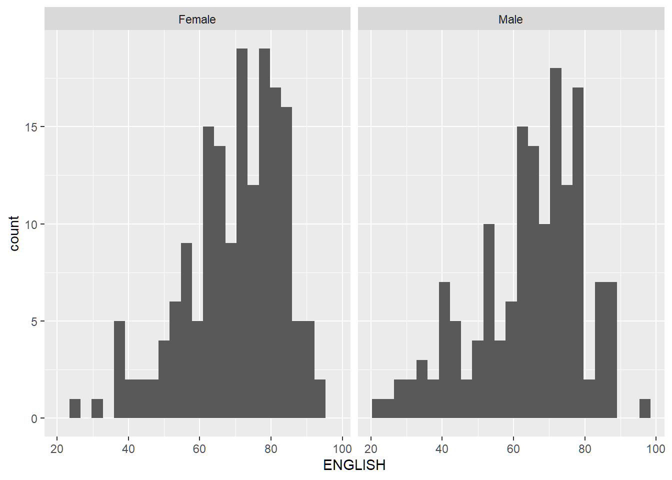
After
The histogram of all pupils is added as a light background to provide context of how each gender scores compared to the overall performance.
exam_data_bg <- exam_data[5]

ggplot(exam_data,
       aes(x=ENGLISH, fill=GENDER)) +
  geom_histogram(data=exam_data_bg, fill='grey', alpha=0.5) +
  geom_histogram(colour='black') +
  facet_wrap(~GENDER) +
  guides(fill='none') +
  theme_bw()
`stat_bin()` using `bins = 30`. Pick better value with `binwidth`.
`stat_bin()` using `bins = 30`. Pick better value with `binwidth`.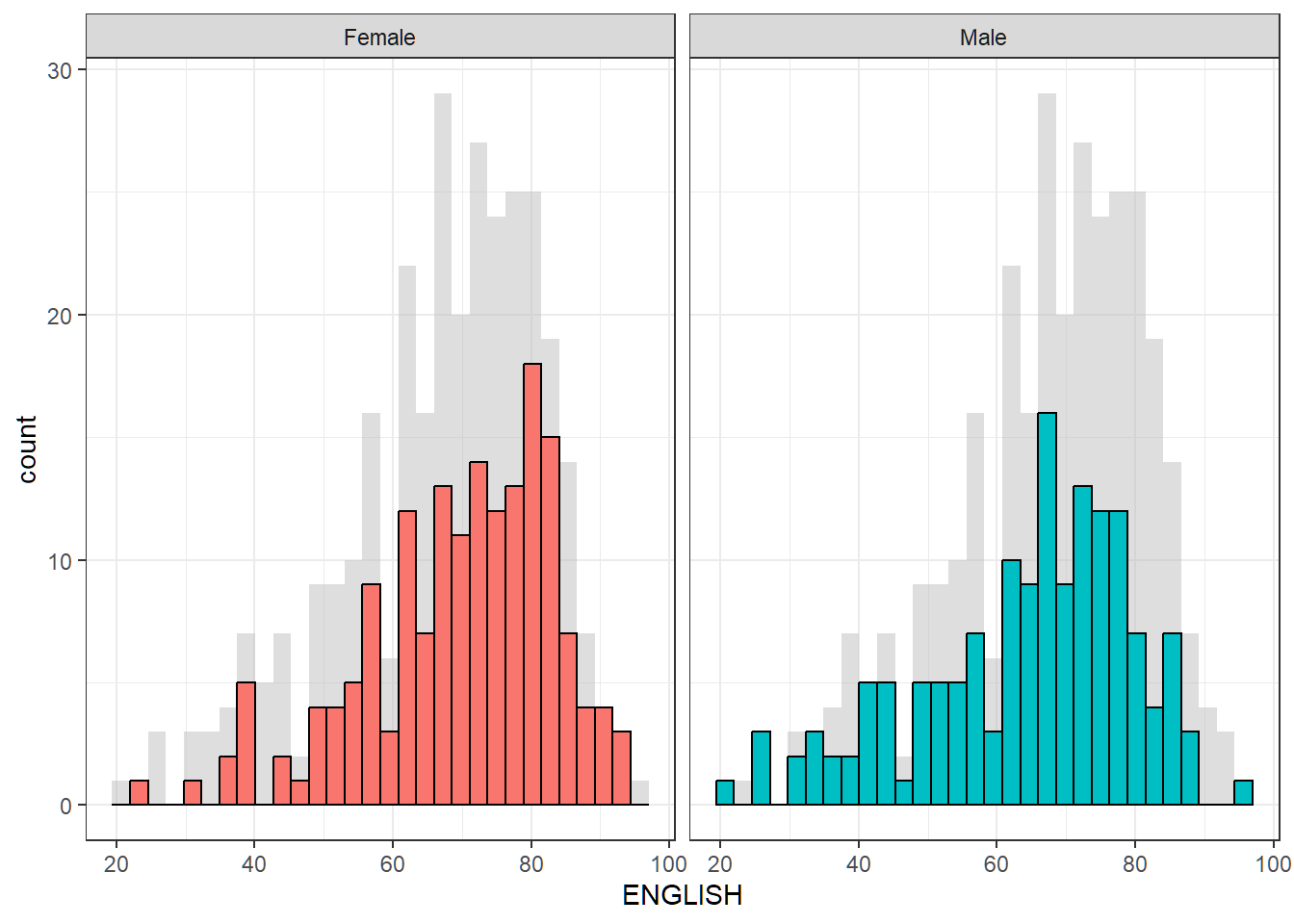
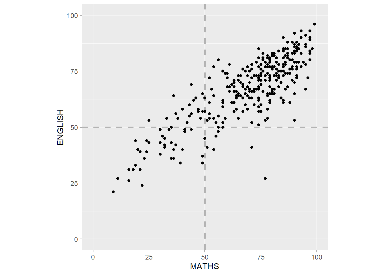
IV. Scatterplot Makeover
Before
Scatterplot of English vs Maths scores. The axis have different scales even though they have the same units, and there are no reference marks indicating the (passing) score of 50%.
ggplot(exam_data,
       aes(x=MATHS, y=ENGLISH)) +
  geom_point()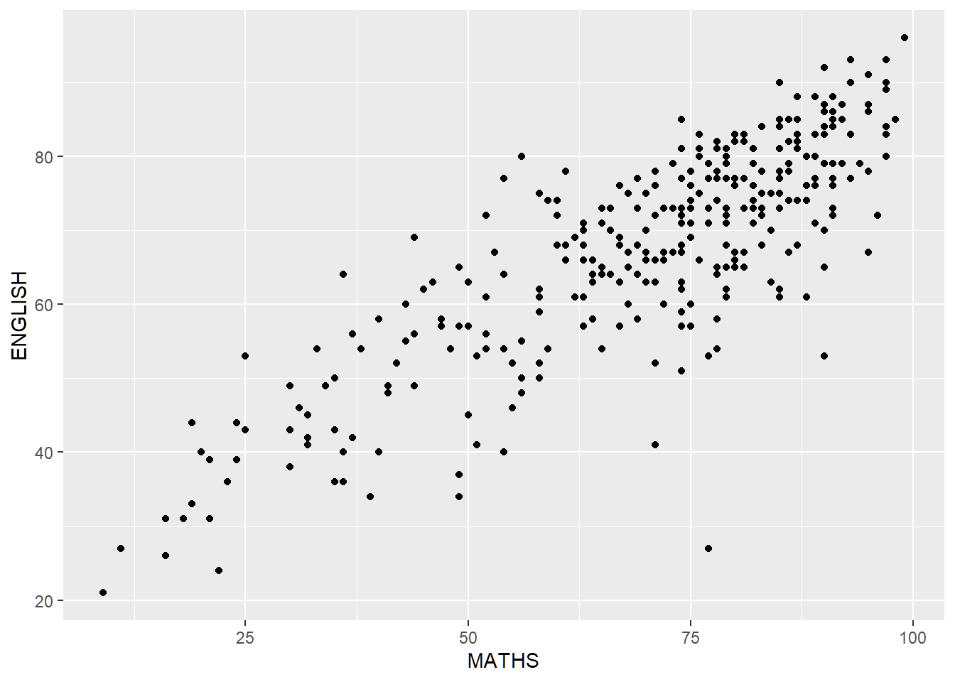
After
Both axes are standardised to the same scale. Reference lines are added to indicate scores of 50%.
ggplot(exam_data,
       aes(x=MATHS, y=ENGLISH)) +
  geom_vline(xintercept=50, color='grey70', linetype='dashed', size=1) +
  geom_hline(yintercept=50, color='grey70', linetype='dashed', size=1) +
  geom_point() +
  coord_fixed(xlim=c(0,100),ylim=c(0,100))