pacman::p_load(tidyverse, magrittr, janitor, lubridate, rstatix, patchwork, ggiraph, ggridges, ggstatsplot, ggdist, ggthemes, gganimate)Take-Home Exercise 1: City of Engagement
1 The Brief
1.1 Setting the Scene
City of Engagement, with a total population of 50,000, is a small city located at Country of Nowhere. The city serves as a service centre of an agriculture region surrounding the city. The main agriculture of the region is fruit farms and vineyards. The local council of the city is in the process of preparing the Local Plan 2023. A sample survey of 1000 representative residents had been conducted to collect data related to their household demographic and spending patterns, among other things. The city aims to use the data to assist with their major community revitalization efforts, including how to allocate a very large city renewal grant they have recently received.
1.2 The Task
Apply the concepts and methods from Lesson 1-4 to reveal the demographic and financial characteristics of the city of Engagement by using appropriate static and interactive statistical graphics methods. This exercise requires a user-friendly and interactive solution that helps city managers and planners to explore the complex data in an engaging way and reveal hidden patterns.
1.3 The User
The city managers and planners for City of Engagement.
1.4 Importing Packages
We first import the packages we wish to use for this exercise:
2 Data Preparation
2.1 Data Overview
We have two datasets to work with for this exercise, Participants.csv and FinancialJournal.csv. We examine them in turn for any data issues, and conduct necessary cleaning/preparation.
2.2 Participants
2.2.1 Description
Contains information about the residents of City of Engagement that have agreed to participate in this study.
| Column | Data Type | Description |
|---|---|---|
participantId |
integer | unique ID assigned to each participant |
householdSize |
integer | the number of people in the participant’s household |
haveKids |
boolean | whether there are children living in the participant’s household |
age |
integer | participant’s age in years at the start of the study |
educationLevel |
string factor | the participant’s education level, one of: {Low, HighSchoolOrCollege, Bachelors, Graduate} |
interestGroup |
char | a char representing the participant’s stated primary interest group, one of {A, B, C, D, E, F, G, H, I, J}. Note: specific topics of interest have been redacted to avoid bias |
joviality |
float | a value ranging from [0,1] indicating the participant’s overall happiness level at the start of the study |
2.2.2 Preparation
Let’s load the data first to see what we have:
participants <- read_csv('data/Participants.csv')Rows: 1011 Columns: 7
── Column specification ────────────────────────────────────────────────────────
Delimiter: ","
chr (2): educationLevel, interestGroup
dbl (4): participantId, householdSize, age, joviality
lgl (1): haveKids
ℹ Use `spec()` to retrieve the full column specification for this data.
ℹ Specify the column types or set `show_col_types = FALSE` to quiet this message.2.2.2.1 Correct Data Types
We can see that several columns have been set to data types different from the given description. Let’s correct the column data types.
participants %<>%
  mutate(across(c('participantId', 'householdSize', 'age'),
                as.integer))

participants %<>%
  mutate(educationLevel = educationLevel %>%
           fct_relevel(c('Low', 'HighSchoolOrCollege','Bachelors','Graduate')))
Double-check the column types are now correct:
participants# A tibble: 1,011 × 7
participantId householdSize haveKids age educationLevel interestGroup
<int> <int> <lgl> <int> <fct> <chr>
1 0 3 TRUE 36 HighSchoolOrCollege H
2 1 3 TRUE 25 HighSchoolOrCollege B
3 2 3 TRUE 35 HighSchoolOrCollege A
4 3 3 TRUE 21 HighSchoolOrCollege I
5 4 3 TRUE 43 Bachelors H
6 5 3 TRUE 32 HighSchoolOrCollege D
7 6 3 TRUE 26 HighSchoolOrCollege I
8 7 3 TRUE 27 Bachelors A
9 8 3 TRUE 20 Bachelors G
10 9 3 TRUE 35 Bachelors D
# ℹ 1,001 more rows
# ℹ 1 more variable: joviality <dbl>2.2.2.2 Check for duplicate records
No duplicate records were found in Participants.
participants %>% get_dupes()# A tibble: 0 × 8
# ℹ 8 variables: participantId <int>, householdSize <int>, haveKids <lgl>,
# age <int>, educationLevel <fct>, interestGroup <chr>, joviality <dbl>,
# dupe_count <int>2.3 Financial Journal
2.3.1 Description
Contains information about financial transactions.
| Column | Data Type | Description |
|---|---|---|
participantId |
integer | unique ID corresponding to the participant affected |
timestamp |
datetime | the time when the check-in was logged |
category |
string factor | a string describing the expense category, one of {Education, Food, Recreation, RentAdjustment, Shelter, Wage} |
amount |
double | the amount of the transaction |
2.3.2 Preparation
Let’s load the data first to see what we have:
financial_journal <- read_csv('data/FinancialJournal.csv')Rows: 1513636 Columns: 4
── Column specification ────────────────────────────────────────────────────────
Delimiter: ","
chr (1): category
dbl (2): participantId, amount
dttm (1): timestamp
ℹ Use `spec()` to retrieve the full column specification for this data.
ℹ Specify the column types or set `show_col_types = FALSE` to quiet this message.2.3.2.1 Correct Data Types
Similar to the Participants data, several columns have been set to data types different from the given description. Let’s correct the column data types as well.
financial_journal %<>%
  mutate(across(participantId, as.integer))

financial_journal %<>%
mutate(across(category, as.factor))financial_journal# A tibble: 1,513,636 × 4
participantId timestamp category amount
<int> <dttm> <fct> <dbl>
1 0 2022-03-01 00:00:00 Wage 2473.
2 0 2022-03-01 00:00:00 Shelter -555.
3 0 2022-03-01 00:00:00 Education -38.0
4 1 2022-03-01 00:00:00 Wage 2047.
5 1 2022-03-01 00:00:00 Shelter -555.
6 1 2022-03-01 00:00:00 Education -38.0
7 2 2022-03-01 00:00:00 Wage 2437.
8 2 2022-03-01 00:00:00 Shelter -557.
9 2 2022-03-01 00:00:00 Education -12.8
10 3 2022-03-01 00:00:00 Wage 2367.
# ℹ 1,513,626 more rows2.3.2.2 Check for duplicate records
There are 2,226 records identified as duplicates:
financial_journal %>% get_dupes()# A tibble: 2,226 × 5
participantId timestamp category amount dupe_count
<int> <dttm> <fct> <dbl> <int>
1 0 2022-03-01 00:00:00 Education -38.0 2
2 0 2022-03-01 00:00:00 Education -38.0 2
3 0 2022-03-01 00:00:00 Shelter -555. 2
4 0 2022-03-01 00:00:00 Shelter -555. 2
5 1 2022-03-01 00:00:00 Education -38.0 2
6 1 2022-03-01 00:00:00 Education -38.0 2
7 1 2022-03-01 00:00:00 Shelter -555. 2
8 1 2022-03-01 00:00:00 Shelter -555. 2
9 2 2022-03-01 00:00:00 Education -12.8 2
10 2 2022-03-01 00:00:00 Education -12.8 2
# ℹ 2,216 more rowsThe duplicates appear to be a quality issue. Let’s remove them:
financial_journal %<>% distinct()

financial_journal %>% get_dupes()
# A tibble: 0 × 5
# ℹ 5 variables: participantId <int>, timestamp <dttm>, category <fct>,
# amount <dbl>, dupe_count <int>2.4 Transient residents?
From initial exploration, we can see that the financial transactions span a year, from 1 Mar 2022 to 28 Feb 2023:
financial_journal %>% summary() participantId timestamp category
Min. : 0.0 Min. :2022-03-01 00:00:00.00 Education : 3018
1st Qu.: 222.0 1st Qu.:2022-05-24 16:05:00.00 Food :790051
Median : 464.0 Median :2022-08-25 16:20:00.00 Recreation :296013
Mean : 480.9 Mean :2022-08-26 08:09:38.58 RentAdjustment: 131
3rd Qu.: 726.0 3rd Qu.:2022-11-27 08:05:00.00 Shelter : 10651
Max. :1010.0 Max. :2023-02-28 23:55:00.00 Wage :412659
amount
Min. :-1562.726
1st Qu.: -5.594
Median : -4.000
Mean : 20.423
3rd Qu.: 21.649
Max. : 4096.526 However, when we look at the range of transaction timestamps per participant, we realise that a small subset of participants only had transactions for a few days in early March. It seems that these participants may be transient residents, such as tourists or business visitors:
transient <- financial_journal %>%
  group_by(participantId) %>%
  summarise(count = n(),
            first = min(timestamp),
            last = max(timestamp)) %>%
  filter(last < '2022-03-10') %>%
  arrange(last)

transient_participants <- participants %>%
  filter(participantId %in% transient$participantId)
For the purpose of this exercise, let us assume that the city planners are not interested in transient residents. Hence, let’s exclude them from the dataset (both Participants and Financial Journal):
participants %<>%
  filter(! participantId %in% transient$participantId)

financial_journal %<>%
  filter(! participantId %in% transient$participantId)
2.5 Aggregating Financial Journal data
The Financial Journal contains individual transactions, both income and expenses. For analysis, we may wish to look at income and expenses separately. Additionally, it is more useful to look at financial transactions at different levels of aggregation, e.g. daily, monthly, annually. Let’s create a new column, category_type, indicating whether a transaction is an Income or an Expense. Then we create 3 new tables for these 3 levels of aggregation respectively, using the library lubridate to help with processing the timestamps:
## add 'transaction_type' column indicating 'Income' or 'Expense'
financial_journal %<>%
  mutate(
    category_type = case_when(
      amount>0 ~ 'Income',
      amount<=0 ~'Expense'
    ))

## daily aggregated transactions per participant
fj_daily <- financial_journal %>%
  mutate(timestamp_date = as.Date(timestamp)) %>%
  group_by(participantId, timestamp_date, category, category_type) %>%
  summarise(amount_total = sum(amount))

## monthly aggregated transactions per participant
fj_monthly <- financial_journal %>%
  mutate(timestamp_month = format_ISO8601(timestamp, precision = "ym")) %>%
  group_by(participantId, timestamp_month, category, category_type) %>%
  summarise(amount_total = sum(amount))

## annual aggregated transactions per participant
fj_annual <- financial_journal %>%
  group_by(participantId, category, category_type) %>%
  summarise(amount_total = sum(amount))
2.6 Joining Participant and Financial Journal data
In order to examine relationships between demographics and finances, it is necessary to join the two datasets. Here, we join the demographics data with the annual financial data:
Show Code
p_fj_annual <- participants %>%
  right_join(fj_annual, by='participantId')
3 Visualisation Exploration
In this section I have prepared a selection of visualisations to help the city planners and managers demographic and financial characteristics of the city to obtain insights.
(There are a bunch of other visualisations I created in the process of exploratory data analysis, which did not turn out to be particularly insightful; I have placed these in the last section for those who may be interested.)
3.1 Demographics
Let’s start by getting an idea of the profile of the residents of the city.
3.1.1 What is the overall age distribution?
We can see that the age distribution of residents is quite uniform.
Visualisation Design Choice
Here I used a histogram as it is the classic choice for visualising population age distribution. After some experimentation I chose a bin width of 3 to strike a balance between detail and being able to see the overall shape.
Show Code
ggplot(data=participants,
             aes(x=age, y=after_stat(count))) +
  geom_histogram(binwidth=3, color='white') +
  # geom_density() +
  scale_x_continuous(name = "age (years)") +
  ggtitle("Generally uniform age distribution",
          subtitle = "Age is quite uniformly distributed.")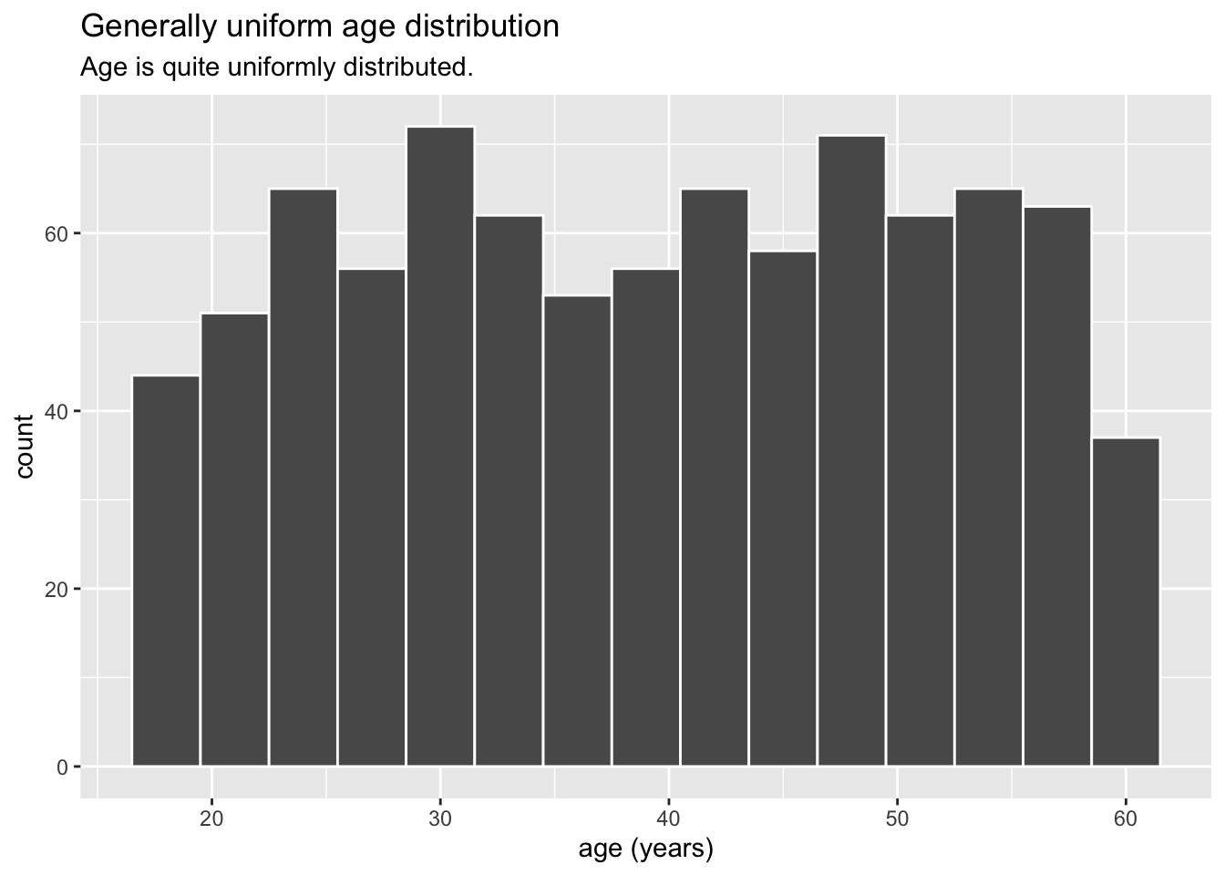
3.1.2 How big are households and do they have kids?
Households are small in the City of Engagement, ranging from 1 to 3 persons. 1- and 2-person households (majority, about 70%) only have adults, while 3-person households (close to 30%) have kids.
Visualisation Design Choice
I chose a bar chart rather than pie chart so that it would be easy to compare their relative proportion and difference, since their proportions are quite close. This is further emphasised by labeling the count and proportion explicitly on each bar. I also used colour to indicate the households that have kids (which corresponds exactly to the 3-person households).
Show Code
ggplot(data=participants,
       aes(y = fct_rev(fct_infreq(as.factor(householdSize))),
           fill = haveKids)) +
  geom_bar() +
  geom_text(aes(label=paste0(after_stat(count), sprintf(' (%.1f%%)', prop*100)), group=1),
            stat='count',
            hjust=1.2,
            colour='white') +
  ylab("Household Size") +
  theme(axis.ticks.y=element_blank(),
        text = element_text(size=12)) +
  scale_fill_discrete(name='', labels=c('No Kids', 'Have Kids')) +
  ggtitle("Small households",
          subtitle = "1- and 2-member (adult-only) households are most common. Largest household size is 3.")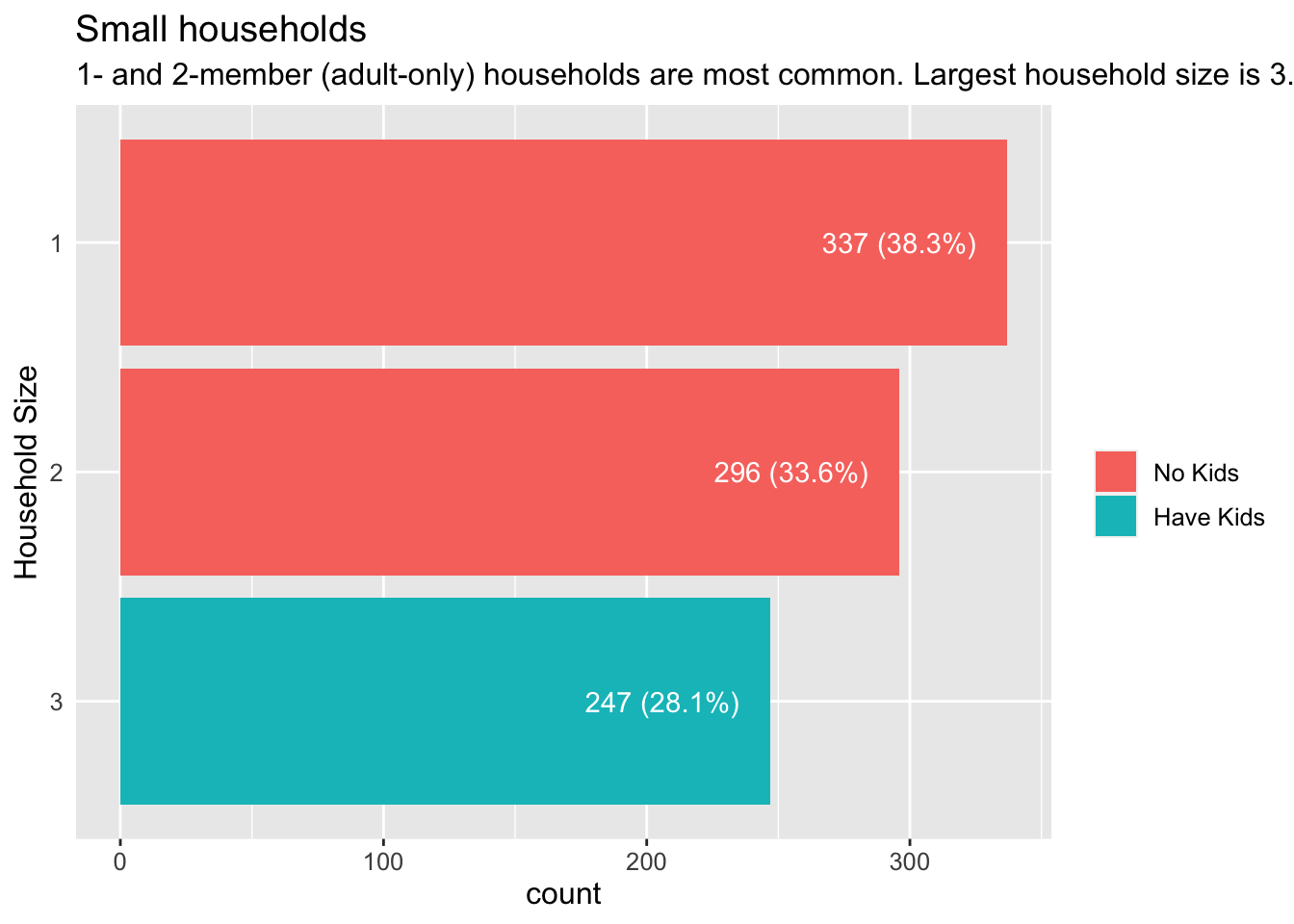
3.1.3 How well-educated are residents?
Residents are highly educated, with more than 90% having at least a high school or college education. In addition, almost a fifth have graduate degrees.
Visualisation Design Choice
I again used bar charts as it seemed to give the clearest representation of the relative number of residents at each level of education.
Show Code
ggplot(data=participants,
             aes(y=educationLevel)) +
  geom_bar() +
  geom_text(aes(label=paste0(after_stat(count), '\n', sprintf('(%.1f%%)', prop*100)), group=1),
            stat='count',
            hjust=1.2,
            colour='white') +
  ylab("Education Level") +
  scale_fill_brewer(palette = 'BuPu', name='Education Level') +
  theme(axis.ticks.y=element_blank(),
        text = element_text(size=12)) +
  ggtitle("Well-educated residents",
          subtitle = "More than 90% have at least high school/college education; \nalmost 20% have graduate qualifications.")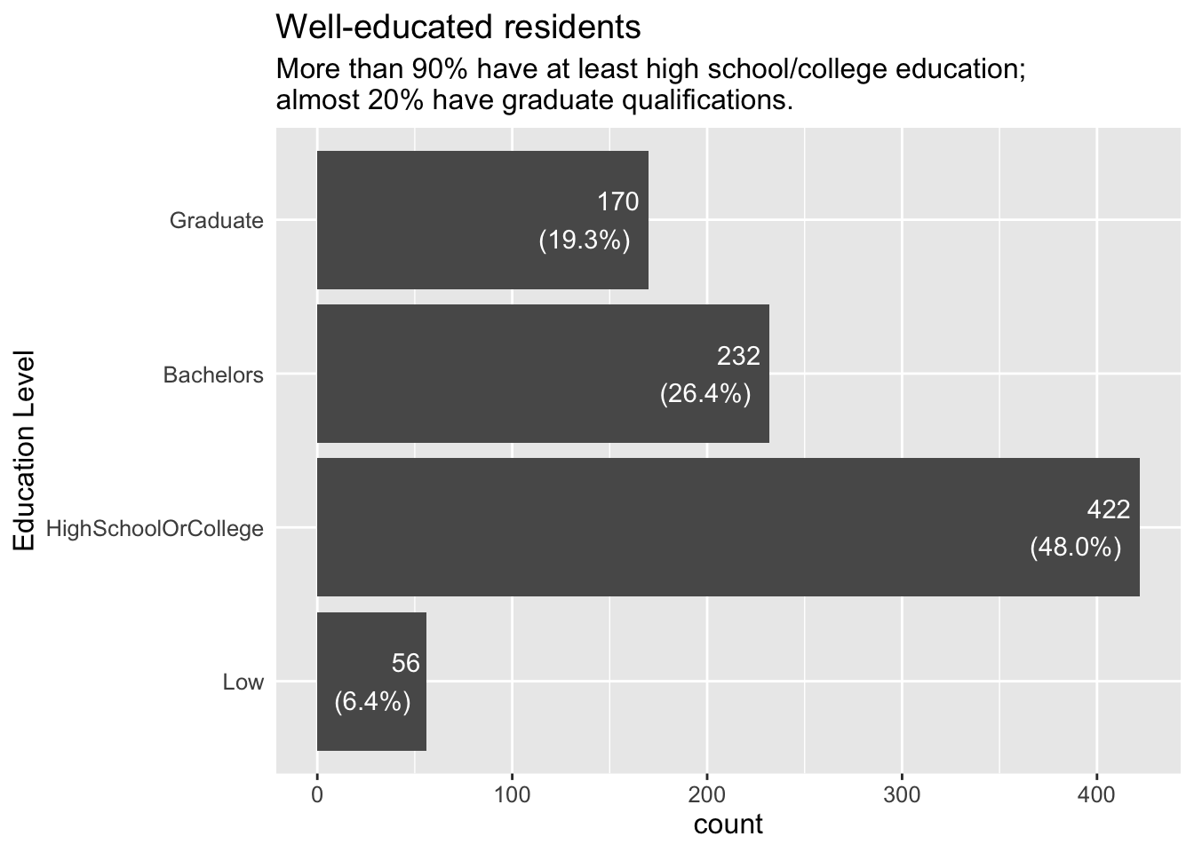
3.1.4 Are more highly educated residents less likely to have kids?
At least in the City of Engagement, it is not true that the more highly educated you are, the less likely you are to have kids. There is no statistically significant relationship between education level and having kids.
Visualisation Design Choice
Here I made use of the ggstatplot library to easily generate a statistical comparison chart to examine a possible relationship between education level and having kids. From the p-value, we can see that there is no statistical evidence to suggest an association between the two.
Show Code
ggbarstats(data = participants,
           x = haveKids,
           y =educationLevel,
           type = 'np')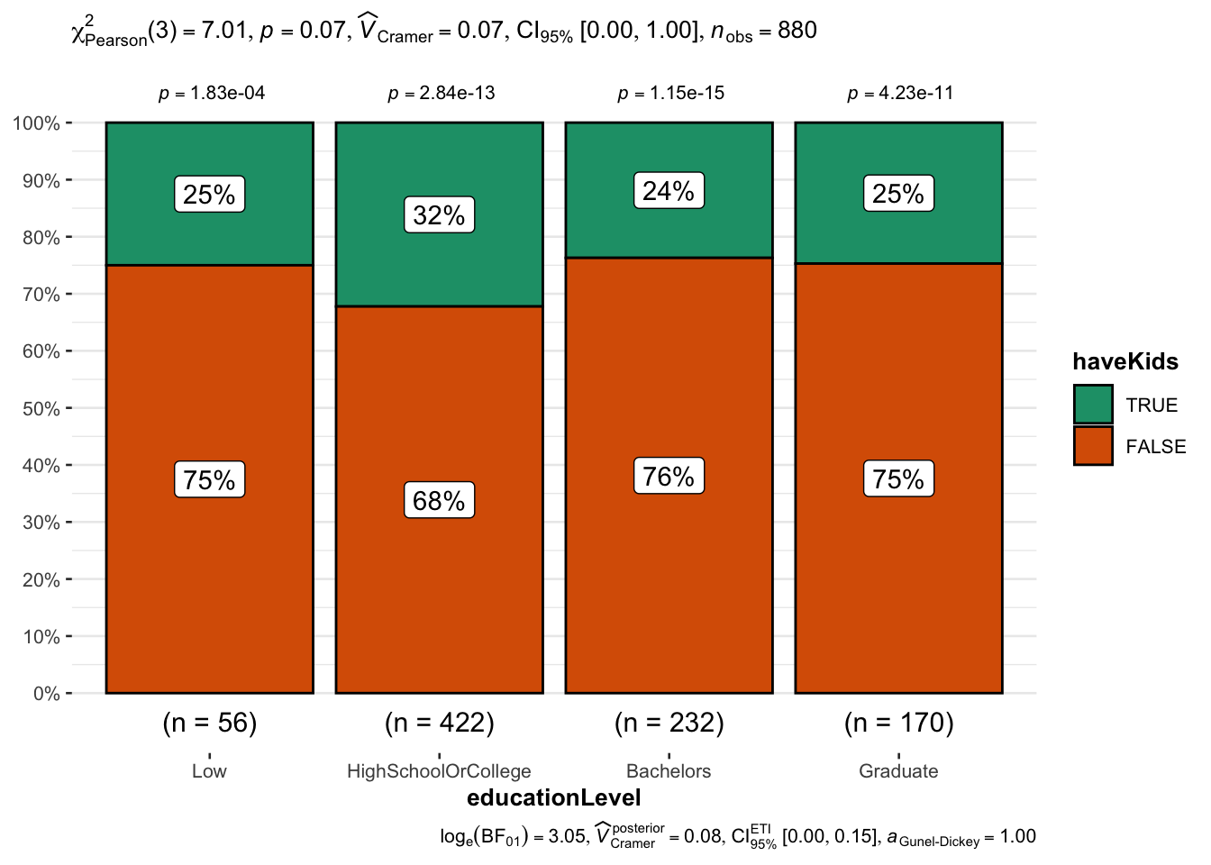
3.2 Overall Financials
3.2.1 What does the overall finances of residents look like?
At the aggregate level, expenses are about a third of income. We also see the largest income category (Wages) and largest expense category (Shelter).
Visualisation Design Choice
Here I used two separate bar charts to compare income and expenses, that were combined using patchwork. Care was taken to ensure that the two x-axis were the same scale, so that direct comparisons between the two charts are possible. Lastly, ggiraph library was used to add interactive tooltips showing the exact amount for each category.
Show Code
p1 <- ggplot(fj_annual%>%group_by(category)%>%summarise(total=sum(amount_total))%>%filter(total>0),
       aes(x='Income', y=total, fill=fct_infreq(category, total))) +
  geom_col_interactive(aes(tooltip=paste0(category, ': ', sprintf('%.0f', abs(total)))),
                       position=position_stack(reverse=TRUE)) +
  scale_y_continuous(name = 'Amount',
                     limits = c(0,5e7),
                     labels = scales::comma) +
  coord_flip() +
  xlab('') +
  scale_fill_brewer(palette = 'Set1', name = 'Income Categories') +
  theme(axis.text.y = element_text(size=12))

p2 <- ggplot(fj_annual%>%group_by(category)%>%summarise(total=sum(amount_total))%>%filter(total<0),
       aes(x='Expense', y=abs(total), fill=fct_infreq(category, abs(total)))) +
  geom_col_interactive(aes(tooltip=paste0(category, ': ', sprintf('%.0f', abs(total)))),
                       position=position_stack(reverse=TRUE)) +
  scale_y_continuous(name = 'Amount',
                     limits = c(0,5e7),
                     labels = scales::comma) +
  coord_flip() +
  xlab('') +
  scale_fill_brewer(palette = 'Set2', name = 'Expense Categories') +
  theme(axis.text.y = element_text(size=12))

p12 <- (p1/p2) +
  plot_annotation(
    title = "In aggregate (Mar 2022 - Feb 2023), residents spent about a third of their income",
    subtitle = "Almost all income comes from Wages, and Shelter is the largest expense."
  )

girafe(code = print(p12),
       width_svg = 10,
       height_svg = 4)
3.3 Income
3.3.1 How are annual wages distributed?
We can see that wage distribution is highly skewed, i.e. a large number of residents earning low- to medium-level wages, and a small number of residents earning high wages.
Visualisation Design Choice
Here I used a so-called raincloud plot to visualise the distribution of income. It comprises a density plot, boxplot and dotplot. Each sub-component communicates a different aspect of the data. The density plot most clearly shows how the data is skewed. The boxplot indicates the median, quartiles and outlier range. The dotplot shows the relative quantity of data points at each wage level, something that is not apparent with just density plot or boxplot.
Show Code
ggplot(fj_annual%>%filter(category=='Wage'),
       aes(x='',y = amount_total)) +
  stat_halfeye(adjust = 0.5,
               justification = -0.2,
               .width = 0,
               point_colour = NA) +
  geom_boxplot(width = .20,
               outlier.shape = NA) +
  stat_dots(side = "left",
            justification = 1.2,
            binwidth = 1000,
            dotsize = .5) +
  coord_flip(ylim=c(0,225000)) +
  scale_y_continuous(name = 'Annual Wage',
                     limits = c(0,5e7),
                     labels = scales::comma) +
  xlab('') +
  theme(axis.ticks.y=element_blank()) +
  theme_minimal() +
  ggtitle("Annual wage distribution is highly skewed",
subtitle="Median wage is less than $50K; highest more than $200K") 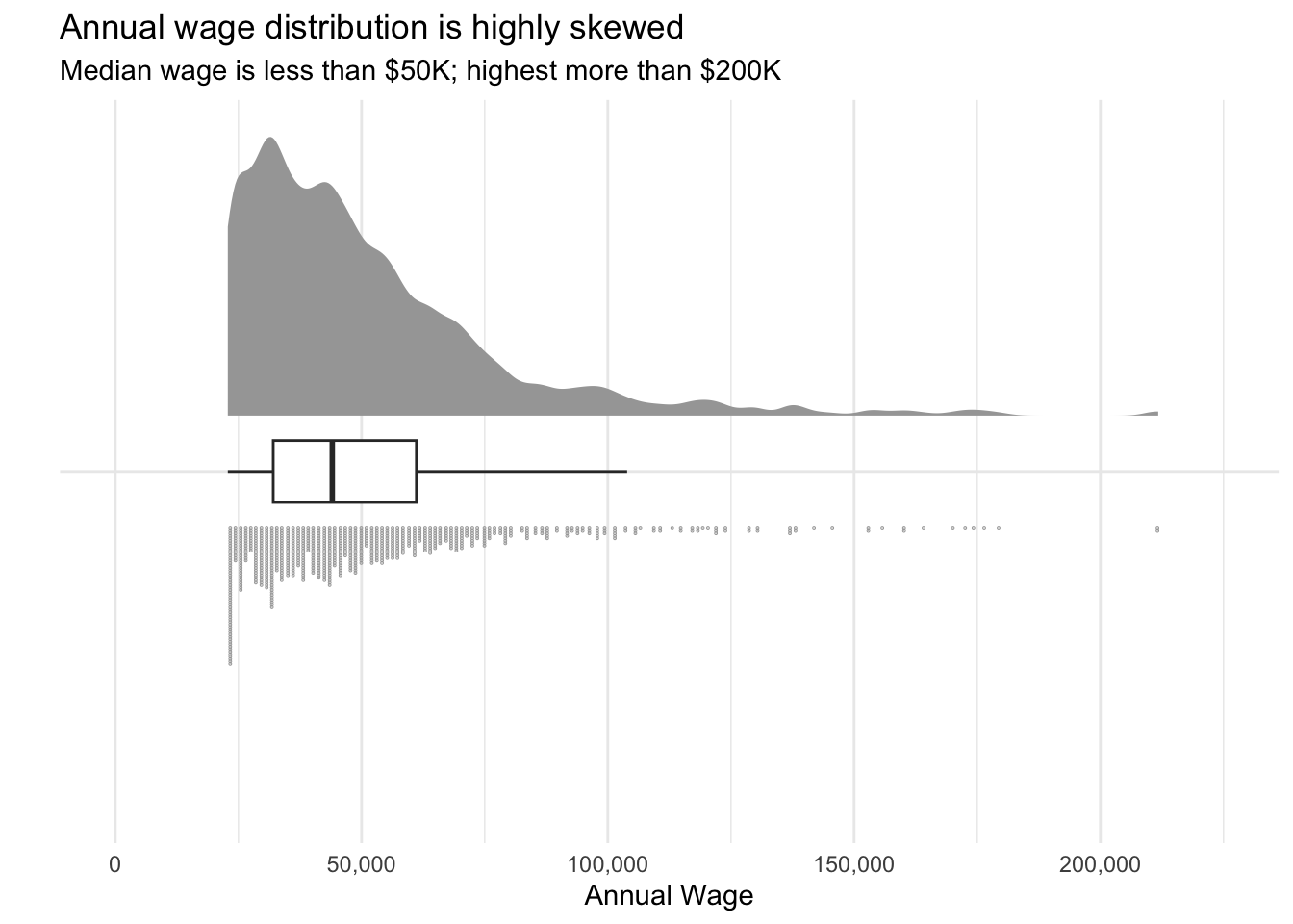
3.3.2 Do wages vary across the months of the year?
We see that monthly wages remain quite stable over the course of a year, except for a spike in March which could be attributed to residents receiving some sort of annual bonus.
Visualisation Design Choice
I felt the classic boxplot did the best job of showing how the distribution of wages in each month remained quite consistent over the course of a year. I tried using a ridgeline plot, but it was not effective as all the plots would overlap almost completely with each other.
Show Code
ggplot(fj_monthly%>%filter(category=='Wage'),
       aes(y=amount_total,x=timestamp_month)) +
  geom_boxplot() +
  scale_y_continuous(name = 'Amount',
                     labels = scales::comma) +
  xlab('Year-Month') +
  theme_minimal() +
  ggtitle("Wages are consistent over most of the year...",
          subtitle = "... Except for a spike in March.")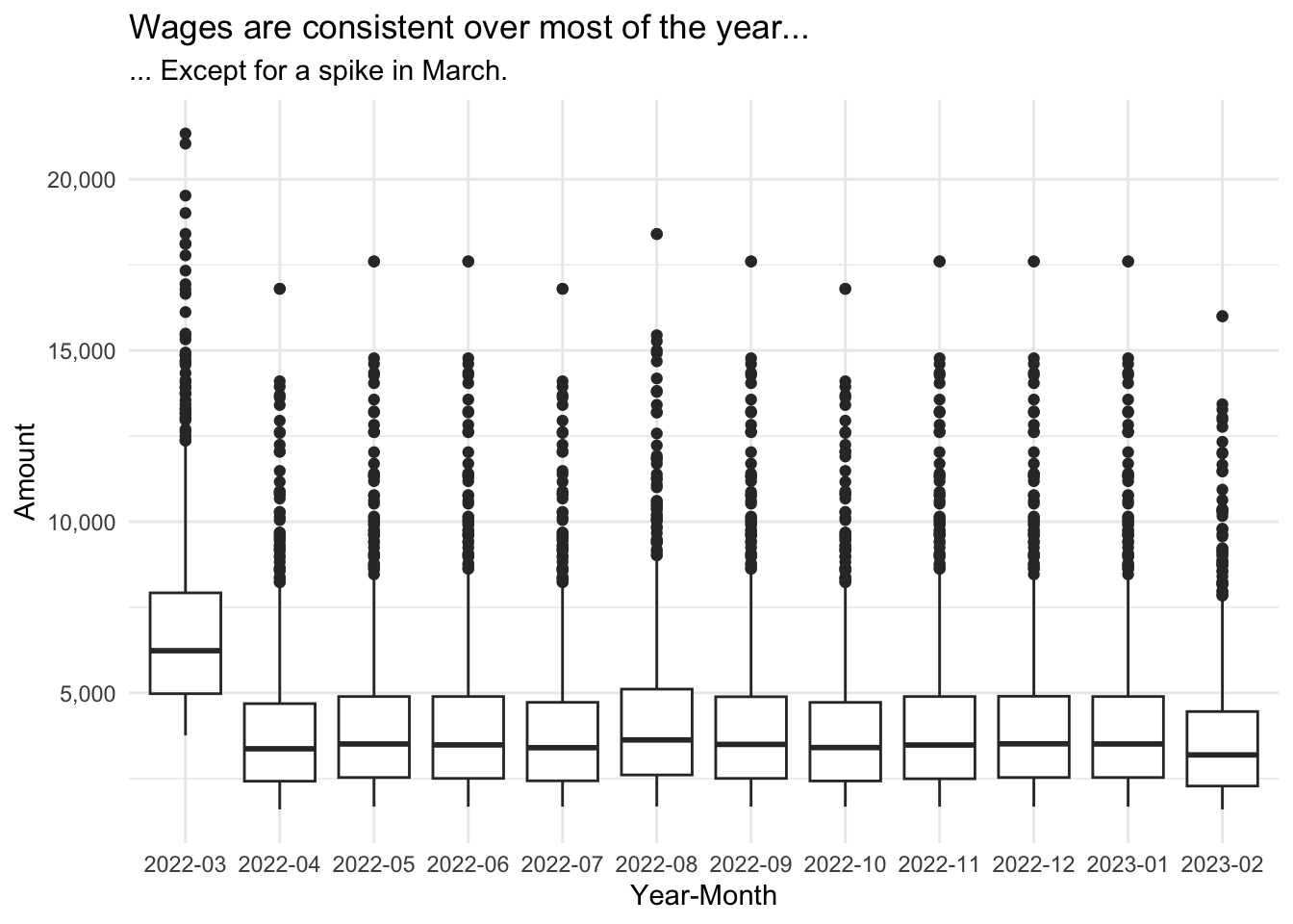
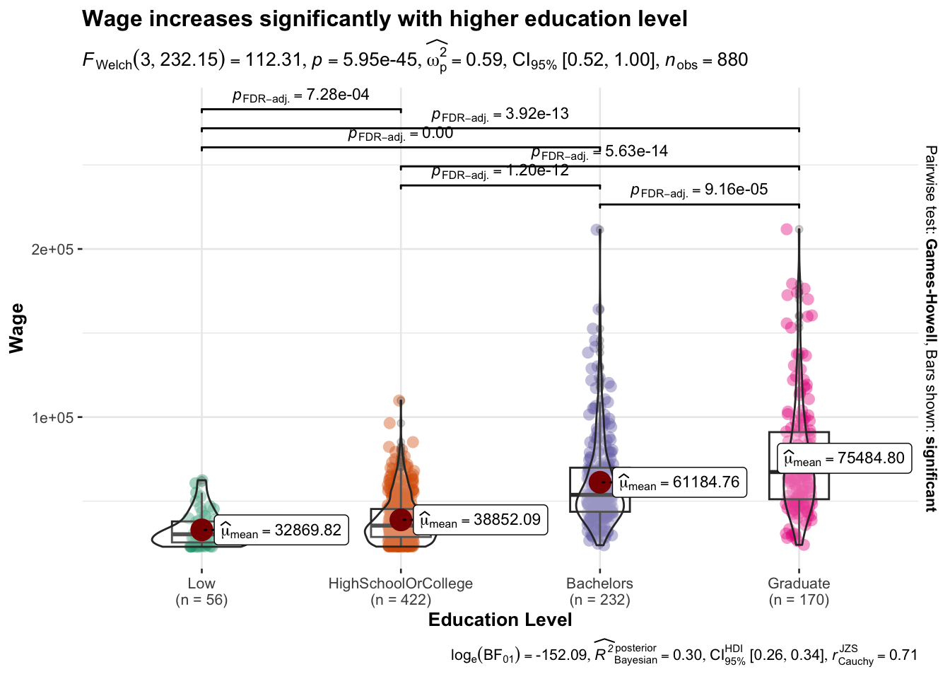
3.3.3 What factors correlate with wages?
3.3.3.1 Education Level
We start with plotting the annual wage by education level, adding bars to indicate the uncertainty. We then used ggstatplot again to generate a visual statistical test of whether wages do in fact vary significantly according to education level.
Show Code
ggplot(
  data = filter(p_fj_annual, category=='Wage'),
  aes(x = educationLevel,
      y = amount_total)) +
  stat_pointinterval(show.legend=TRUE) +
  scale_y_continuous(name = 'Amount',
                     labels = scales::comma) +
  ggtitle("Mean wages",
          subtitle = "With confidence interval indication")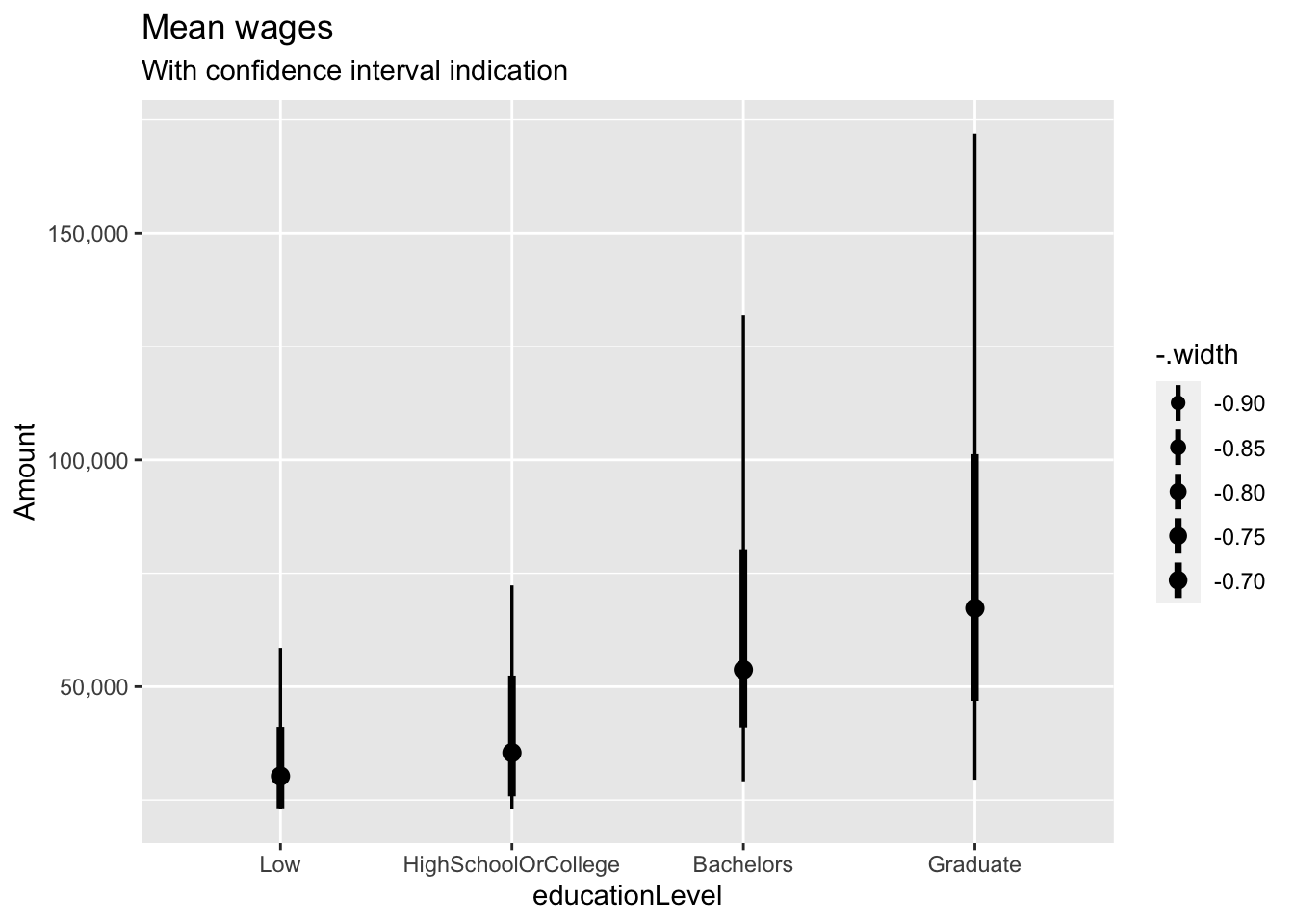
Show Code
ggbetweenstats(
  data = filter(p_fj_annual, category=='Wage'),
  x = educationLevel,
  y = amount_total,
  type = "p",
  mean.ci = TRUE,
  pairwise.comparisons = TRUE,
  pairwise.display = "s",
  p.adjust.method = "fdr",
  messages = FALSE,
  title = "Wage increases significantly with higher education level",
  xlab = "Education Level",
  ylab = "Wage"
)
3.3.3.2 Joviality
It was interesting to see if there was any relationship between joviality and wage (“Does money buy happiness?” etc.) It seems that at low to medium wage levels (below about $75K), there is little to no relation between joviality and wage. However as wages continue to increase, a strong downward trend of joviality becomes apparent.
Visualisation Design Choice
When examining the relationship between two quantitative variables, a scatterplot is the obvious choice. To make the graph even more informative, I added two more mappings: colour to indicate the education level, and size to indicate the household size. Visually, I also lowered the alpha values to improve legibility.
Show Code
ggplot(filter(p_fj_annual, category=='Wage'),
       aes(y=joviality,
           x=amount_total,
           fill=educationLevel,
           size=householdSize)) +
  geom_point(pch=21, color='white', alpha=0.7) +
  scale_x_continuous(name = 'Annual Wage',
                     labels = scales::comma) +
  scale_y_continuous(name = "Joviality",
                     limits = c(0,1)) +
  scale_fill_discrete(name="Education Level") +
  scale_radius(
    name = "Household Size",
    range = c(1, 3),
    limits = c(1, 3),
    breaks = c(1, 2, 3),
    guide = guide_legend(
      override.aes = list(fill = "gray40"))) +
  theme_minimal() +
  ggtitle("Joviality trends downards at high wages",
          subtitle = "At lower wages, wages and joviality are not strongly related")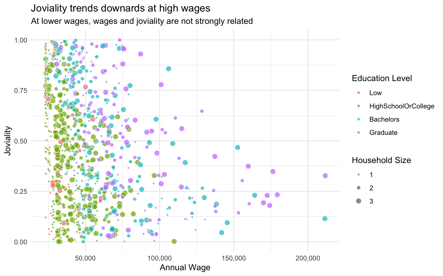
3.4 Expenses
3.4.1 Distribution of spend amount in each expense category?
Here we see that the distribution of spend varies a lot between expense categories. Shelter has the widest range of spending, followed by Recreation, Food and Education. Shelter and Food are interesting as they clearly show two humps, i.e. a bimodal distribution.
Visualisation Design Choice
I wanted to compare multiple distributions, so a ridgeline plot for each variable seemed to make sense. This method shows the characteristics of each distribution very clearly compared to boxplots (e.g. a boxplot would not have surfaced the bimodal distributions of Food and Shelter). The jittered data points below give a sense of the number of data points in each category, that would otherwise not be obvious from the density plot alone. For example, from the jittered points we can see that actually relatively few residents spend money on Education.
Show Code
ggplot(filter(fj_annual, category_type=='Expense'),
       aes(y=category,
           x=abs(amount_total))) +
  stat_density_ridges(quantile_lines=TRUE, quantiles=2,
                      scale=0.8,
                      rel_min_height=0.01,
                      bandwidth=500,
                      jittered_points = TRUE,
                      position = 'raincloud',
                      point_size=0.1,
                      point_alpha=0.7,
                      fill='azure2',
                      color='azure4',
                      alpha=0.8) +
  scale_x_continuous(name = 'Amount',
                     limits = c(0,20000),
                     labels = scales::comma) +
  scale_y_discrete(name = '') +
  theme_minimal() +
  theme(axis.text.y = element_text(size=10)) +
  ggtitle("Distribution of annual expenses across categories",
          subtitle = "Vertical line indicates median value")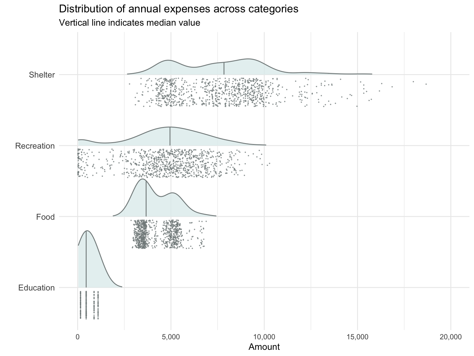
3.4.2 How do expenses vary from month to month?
On average, expenses are quite consistent from month to month over the course of a year, except for higher Shelter and Recreation expenses in March.
Visualisation Design Choice
A simple line graph is effective in displaying month-to-month changes in expense in each category.
Show Code
fj_monthly_grouped <- fj_monthly %>%
  group_by(timestamp_month, category, category_type) %>%
  summarise(amount_total = mean(amount_total)) %>%
  ungroup()

fj_final_month <- fj_monthly_grouped %>%
  filter(timestamp_month=='2023-02' & category_type=='Expense') %>%
  arrange(desc(amount_total))


ggplot(
  data = filter(fj_monthly_grouped, category_type=='Expense'),
  aes(x = timestamp_month,
      y = abs(amount_total),
      color = category,
      group=category)) +
  geom_line(size=.5) +
  geom_point(size=1) +
  scale_color_discrete(name = 'Expense Categories') +
  xlab('Year-Month') +
  ylab('Mean expense') +
  ggtitle("Expenses across categories are consistent over most of the year...",
          subtitle = "... Except for higher Shelter and Recreation expenses in March.")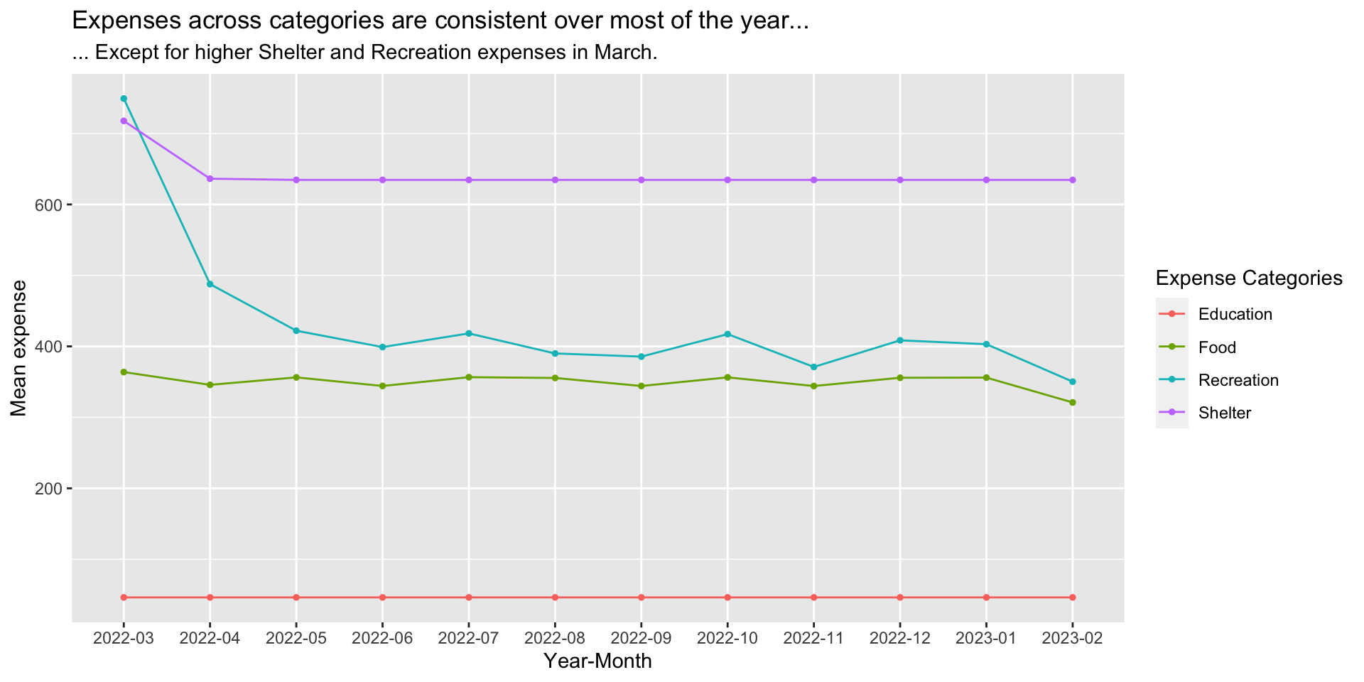
3.4.3 Does spending pattern change with amount of income?
We see that generally as income increases, the proportion of expenses in each category gradually decrease. In other words, at higher incomes, increase in income does not lead to significant increase in expenditures, and most of the money is probably being saved or invested.
Visualisation Design Choice
Here I wanted to be able to visualise if and how the proportion of income spent on various expenses change as income changes. I started with a scatterlot of overall expense percentage versus income. Then I added a second graph, a scatterplot facet wrap that breaks down the expense percentage by expense category. I added interactivity so that when you hover over a point in the first graph, the corresponding points in the facet wrap subgraphs are highlighted as well.
Show Code
p_fj_annual_wage <- p_fj_annual %>%
  filter(category=='Wage')

p_fj_annual_expense_wage <- p_fj_annual %>%
  left_join(select(p_fj_annual_wage, participantId, wage=amount_total))

p_fj_annual_spread <- p_fj_annual %>%
  select(-category_type) %>%
  spread(category, amount_total, fill=0) %>%
  mutate(income_total = Wage+RentAdjustment) %>%
  mutate(expense_total = Shelter+Recreation+Food+Education) %>%
  mutate(expense_pct = expense_total/income_total)

p1 <- ggplot(p_fj_annual_spread,
             aes(x=income_total, y=abs(expense_pct))) +
  geom_point_interactive(aes(data_id = participantId),
                         alpha=0.7) +
  scale_x_continuous(name = 'Income',
                     limits = c(0,250000),
                     labels = scales::comma) +
  scale_y_continuous(name = 'Total expense as percent of income',
                     limits = c(0,1),
                     labels = scales::percent_format()) +
  ggtitle("Relationship between income and expense")

p2 <- ggplot(filter(p_fj_annual_expense_wage, category_type=='Expense'),
       aes(x=wage, y=abs(amount_total)/wage,
           fill=category,
           size=householdSize)) +
  geom_point_interactive(aes(data_id = participantId),
                         pch=21, color='white', alpha=0.7) +
  scale_x_continuous(name = 'Income',
                     limits = c(0,250000),
                     labels = scales::comma) +
  scale_y_continuous(name = 'Expense as percent of income',
                     limits = c(0,0.6),
                     labels = scales::percent_format()) +
  scale_radius(
    name = "Household Size",
    range = c(1, 3),
    limits = c(1, 3),
    breaks = c(1, 2, 3),
    guide = guide_legend(
      override.aes = list(fill = "gray40"))) +
  facet_wrap(~category)

girafe(code = print(p1/p2),
       width_svg = 10,
       height_svg = 10,
       options = list(
         opts_hover(css = "fill: #202020;"),
         opts_hover_inv(css = "opacity:0.2;")
         ))
Visualisation Design Choice
Here is another attempt at visualising how expenses change as income increases, this time using animation (provided by gganimate).
Show Code
fj_annual_expense_wage_binned <- p_fj_annual_expense_wage %>%
  mutate(wage_binned = cut(wage, seq(min(wage)%/%1000*1000, max(wage)%/%1000*1000+1000, 1000), dig.lab = 10)) %>%
  group_by(category_type, category, wage_binned) %>%
  summarise(avg_amount = mean(amount_total))

gg <- ggplot(filter(fj_annual_expense_wage_binned, category != 'RentAdjustment'),
       aes(y=category, x=abs(avg_amount),
           fill=category)) +
  geom_col() +
  scale_x_continuous(name = 'Expense',
                     limits = c(0,200000),
                     labels = scales::comma)
  labs(title = 'Income bracket: {closest_state}') +
transition_states(wage_binned, transition_length = 30, state_length = 10)NULL3.4.4 What expenses correlate with joviality?
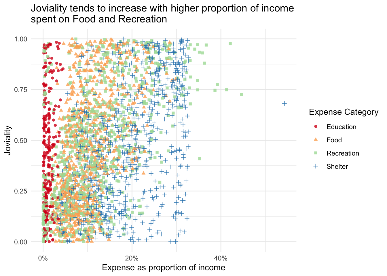
There is a gentle upward trend in joviality as the proportion of expenses on Food and Recreation increases.
Show Code
ggplot(filter(p_fj_annual_expense_wage, category_type=='Expense'),
       aes(y=joviality,
           x=abs(amount_total)/wage,
           color=category,
           shape=category)) +
  geom_point(alpha=0.8) +
  # geom_smooth(size=0.5) +
  scale_x_continuous(name = 'Expense as proportion of income',
                     labels = scales::percent_format()) +
  scale_y_continuous(name = "Joviality",
                     limits = c(0,1)) +
  scale_color_brewer(name="Expense Category", palette = 'Spectral') +
  scale_shape_discrete(name="Expense Category") +
  # facet_wrap(~category) +
  theme_minimal() +
  ggtitle("Joviality tends to increase with higher proportion of income \nspent on Food and Recreation",
          )
3.5 Other Visualisations
3.5.1 Does household size vary with age?
Show Code
ggplot(data=participants,
       aes(x=age, y=after_stat(count))) +
  geom_density(data=select(participants, age), fill='grey', color='transparent', alpha=0.5) +
  geom_density(alpha=0.5, fill='turquoise', color='turquoise') +
  facet_wrap(~householdSize) +
  ggtitle("No significant association between age and household size")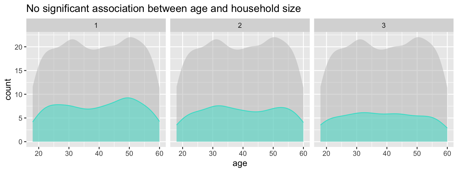
3.5.2 Does education level vary with age?
Show Code
ggplot(data=participants,
       aes(x=age, y=after_stat(count))) +
  geom_density(data=select(participants, age), fill='grey', color='transparent', alpha=0.5) +
  geom_density(alpha=0.5, fill='orange', color='orange') +
  facet_wrap(~educationLevel, nrow=1) +
  ggtitle("No significant association between age and education level")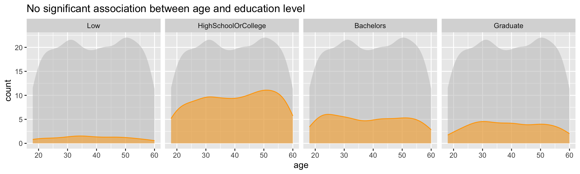
Show Code
ggplot(participants,
       aes(x=age, y=after_stat(count),fill=fct_rev(educationLevel), color=fct_rev(educationLevel))) +
  geom_density(position='stack') +
  scale_fill_brewer(palette = 'BuPu', name='Education Level') +
  scale_color_brewer(palette = 'BuPu', name='Education Level') +
  ggtitle("No significant variation in education level by age")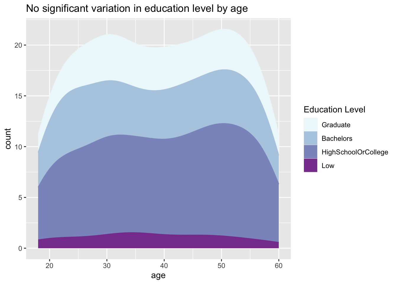
3.5.3 Are some interest groups more popular than others overall?
Show Code
ggplot(data=participants,
       aes(y = fct_rev(fct_infreq(interestGroup)))) +
  geom_bar() +
  geom_text(aes(label=paste0(after_stat(count), sprintf(' (%.1f%%)', prop*100)), group=1),
            stat='count',
            hjust=1.2,
            colour='white') +
  ylab("Interest Group") +
  theme(axis.ticks.y=element_blank(),
        text = element_text(size=12)) +
  ggtitle("No significant difference in popularity of interest groups")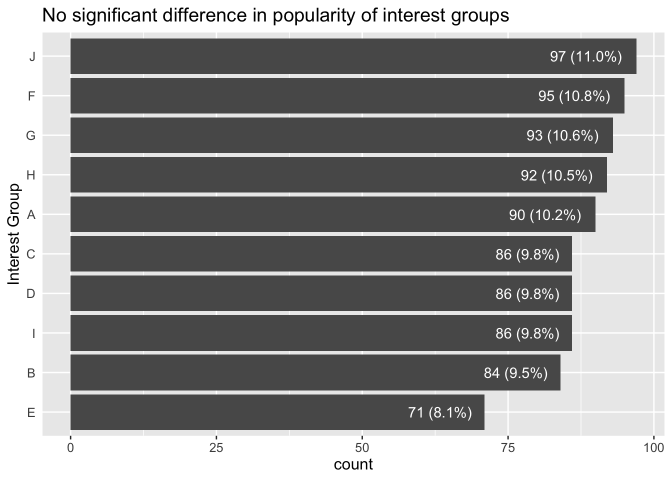
3.5.4 Does age profile vary between different interest groups?
Show Code
ggplot(data=participants,
       aes(x=age, y=after_stat(count))) +
  geom_density(data=select(participants, age), fill='grey', color='grey', alpha=0.5) +
  geom_density(alpha=0.5, fill='turquoise', color='turquoise') +
  facet_wrap(~interestGroup) +
  ggtitle("No significant association between age and interest group")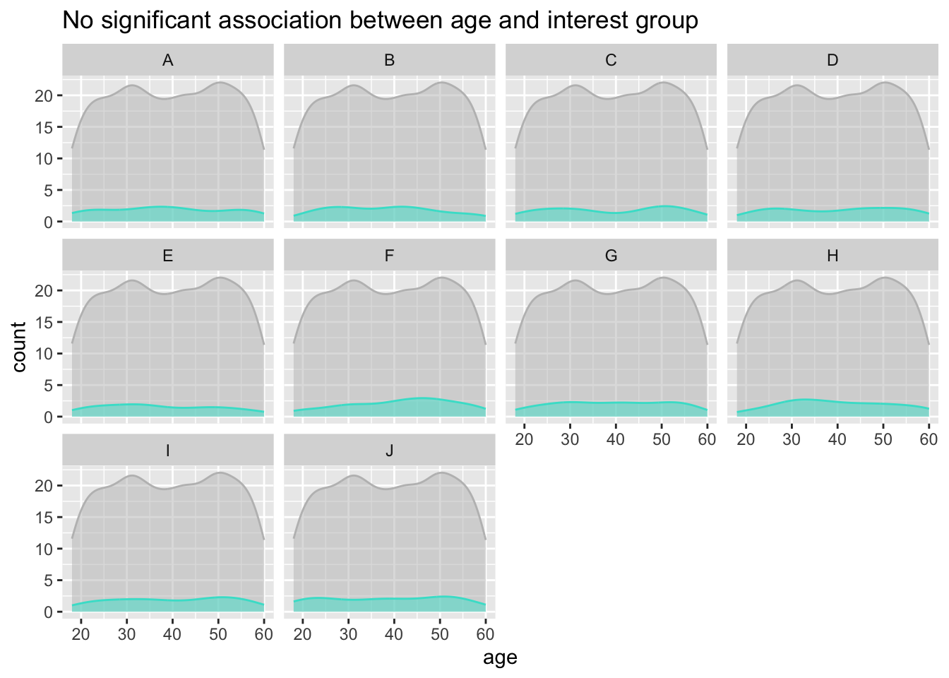
3.5.5 Wage distribution visualisation using ECDF
Show Code
ggplot(fj_annual%>%filter(category=='Wage'),
       aes(x=amount_total, y=..y..)) +
  stat_ecdf(geom = "step")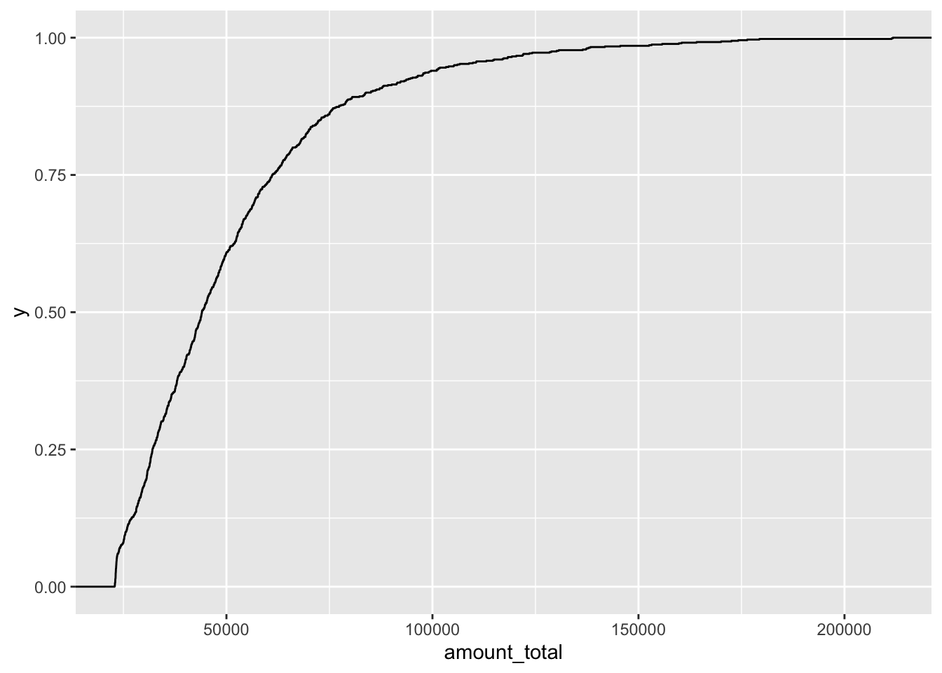
3.5.6 Alternate visualisation of Distribution of spend amount in each expense category
Show Code
ggplot(filter(fj_annual, category_type=='Expense'),
       aes(x=abs(amount_total),
           y=after_stat(count),
           fill=category,
           color=category)) +
  geom_density(bw=500, alpha=0.5) +
  scale_fill_discrete(name="Expense Category") +
scale_color_discrete(name="Expense Category") 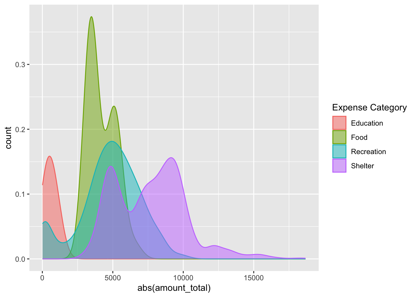
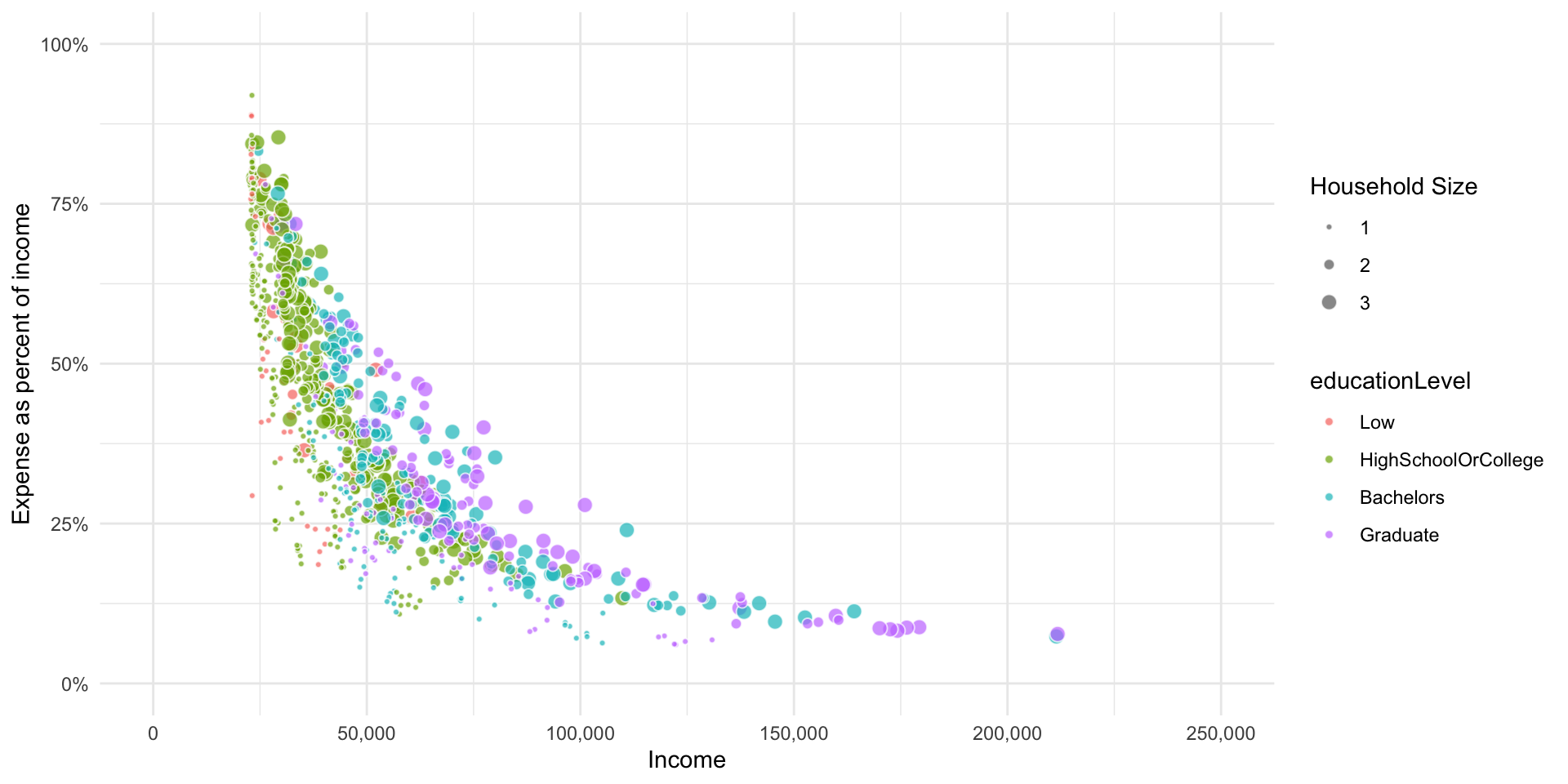
3.5.7 Total expenses percent versus income
Show Code
p_fj_annual_spread <- p_fj_annual %>%
  select(-category_type) %>%
  spread(category, amount_total, fill=0) %>%
  mutate(income_total = Wage+RentAdjustment) %>%
  mutate(expense_total = Shelter+Recreation+Food+Education) %>%
  mutate(expense_pct = expense_total/income_total)

ggplot(p_fj_annual_spread,
       aes(x=income_total,
           y=abs(expense_pct),
           fill=educationLevel,
           size=householdSize)) +
  geom_point(pch=21, color='white', alpha=0.7) +
  scale_x_continuous(name = 'Income',
                     limits = c(0,250000),
                     labels = scales::comma) +
  scale_y_continuous(name = 'Expense as percent of income',
                     limits = c(0,1),
                     labels = scales::percent_format()) +
  scale_radius(
    name = "Household Size",
    range = c(1, 3),
    limits = c(1, 3),
    breaks = c(1, 2, 3),
    guide = guide_legend(
      override.aes = list(fill = "gray40"))) +
  theme_minimal()